Experience Level: Intermediate
Creating columns that behave the way you want them to can be frustrating when designing a Canvas app. The default templates work great for simple apps that don’t need a lot of visual elements, but they are not a one-size-fits-all solution. If you want full control over your layout, knowing how to arrange containers will allow you to create better looking layouts that will fit your content a lot better.
In this guide, I will show you how to create multiple columns and resize them to fit your needs. For this example, I will start with a Blank Canvas and show you how to add a two-column layout and a three-column layout.
Recommended Knowledge:
- A basic understanding of how to create a new Power App in Power App Studio
- A basic understanding of how to find your way around the Power App Studio features
- A basic understanding of how to add a Container to your Canvas app
- A basic understanding of how to edit the properties of a Container
Using Containers (Preferred Method)
Power Apps use containers which provide a more responsive and easier way to manage layouts.
Steps to Create a Responsive Two Column Layout with Containers:
- Insert a Horizontal Container:
- Go to the “Insert” tab, select “Container,” and choose “Horizontal container.”
- This container will hold the two columns
- Set Container Properties:
- Set the ‘Width’ of the container to cover the desired area of the screen (e.g., ‘Parent.Width’ for full screen width).
- Set the ‘Height’ property to fit your content.
- Insert Two Vertical Containers:
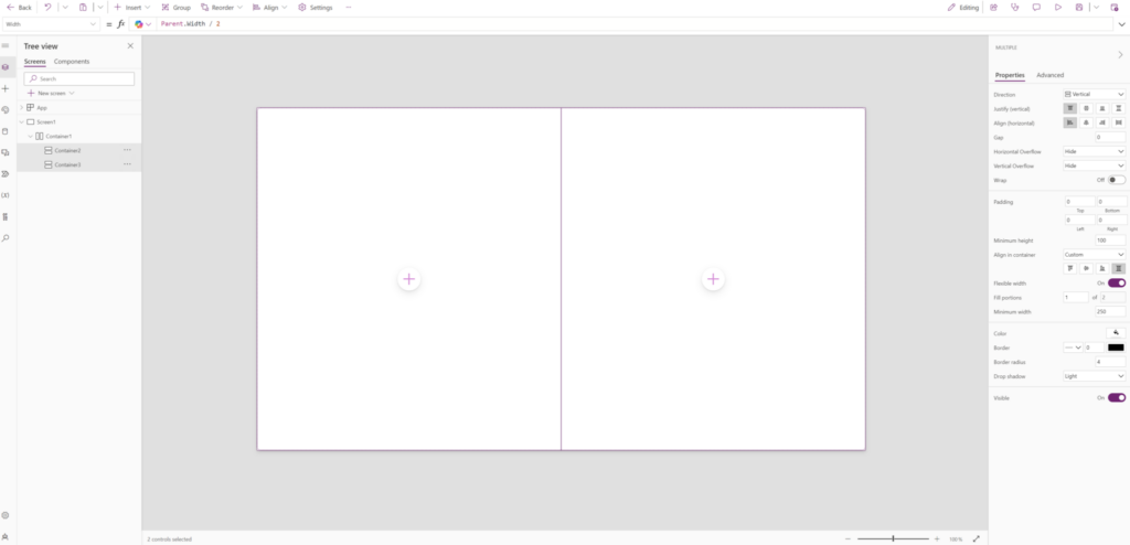
- Inside the horizontal container, insert two “Vertical containers” (one for each column).
- Set the ‘Width’ property of each vertical container to 50% (or Parent.Width / 2).
- Set a Custom Width for Each Column (Optional):
- First column: Set the ‘Width’ property to ‘Parent.Width * 0.25‘.
- Second column: Set the ‘Width’ property to ‘Parent.Width * 0.70‘.
- Add Controls:
- Add controls like labels, text inputs, etc., inside each vertical container. They will automatically align within the two columns.

Steps to Create a Responsive Three Column Layout with Containers:
- Insert a Horizontal Container:
- Go to the “Insert” tab, select “Container,” and choose “Horizontal container.”
- This container will hold the three columns.
- Set Container Properties:
- Set the ‘Width’ of the container to cover the desired area of the screen (e.g., ‘Parent.Width’ for full screen width).
- Set the ‘Height’ property to fit your content.
- Insert Three Vertical Containers:
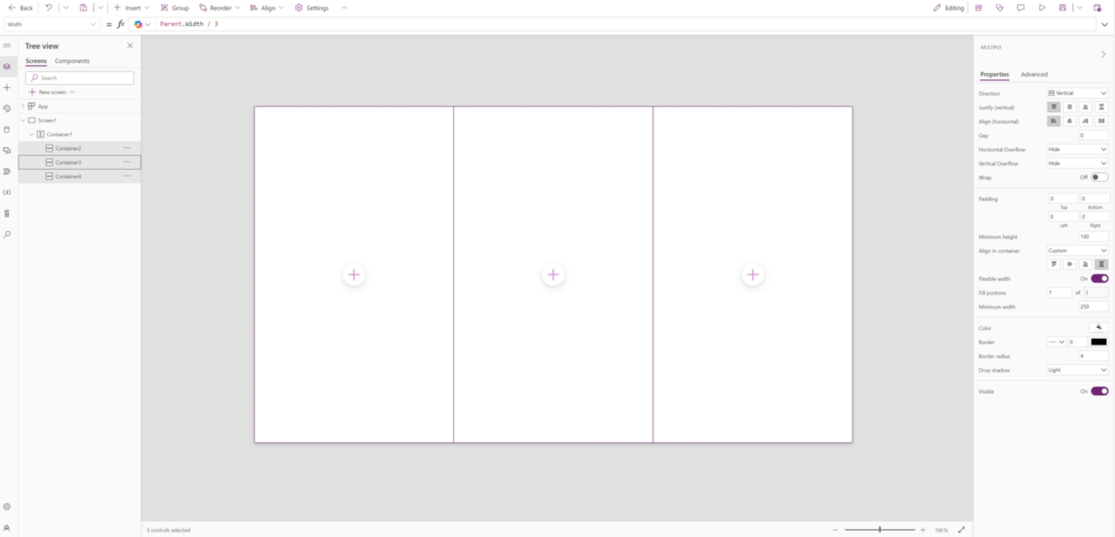
- Inside the horizontal container, insert three “Vertical containers” (one for each column).
- Set the ‘Width’ property of each vertical container to 33.3% (or Parent.Width / 3) to create three equal width columns.
- Set a Custom Width for Each Column (Optional):
- First column: Set the ‘Width’ property to ‘Parent.Width * 0.25‘.
- Second column: Set the ‘Width’ property to ‘Parent.Width * 0.50‘.
- Third column: Set the ‘Width’ property to ‘Parent.Width * 0.25‘.
- Add Controls:
- Add controls like labels, text inputs, etc., inside each vertical container. They will automatically align within the three columns.


0 Comments